PERIOD TRACKER APP DESIGN
HIERARCHY, UX/UI, WAYFINDING, AND FIGMA
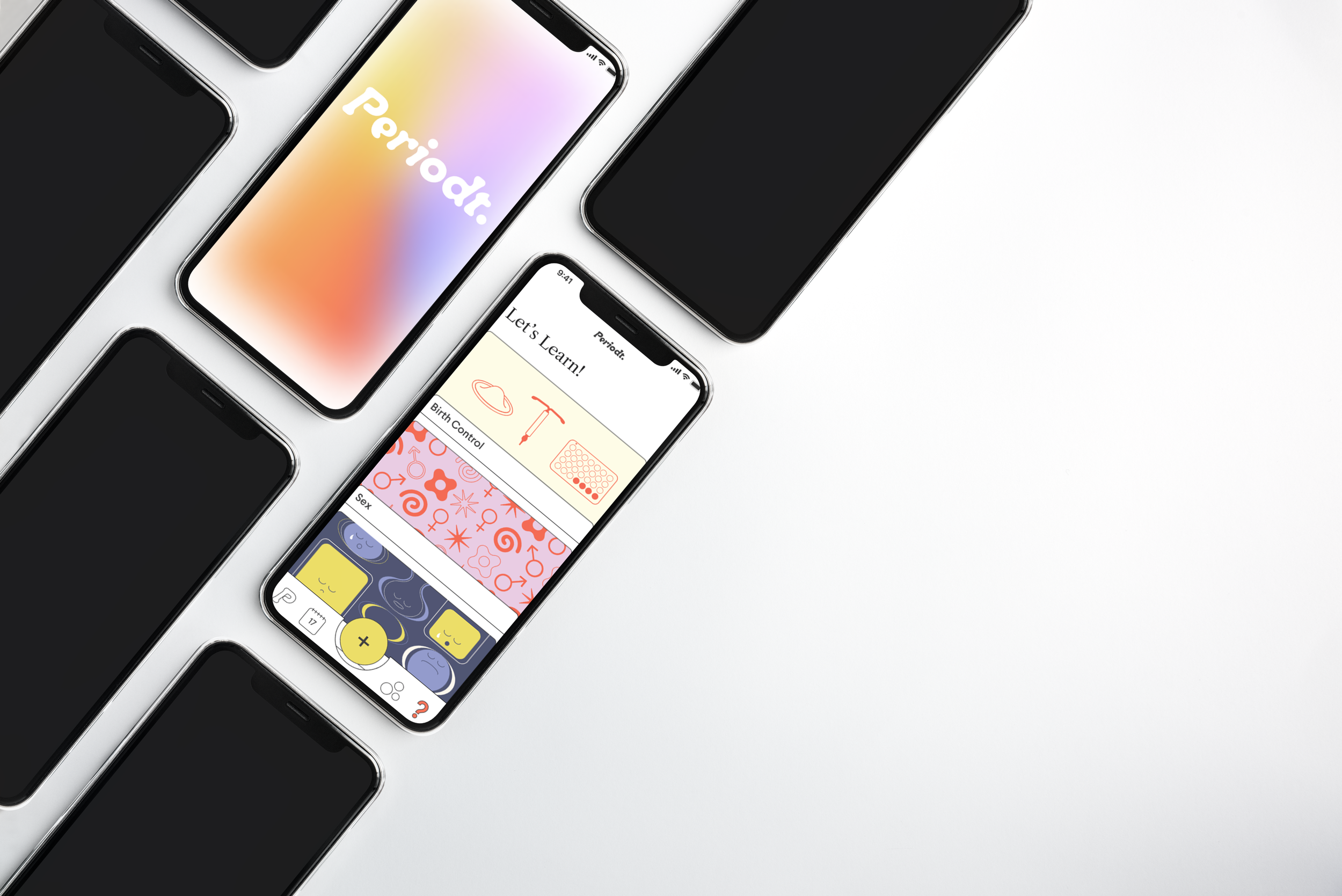
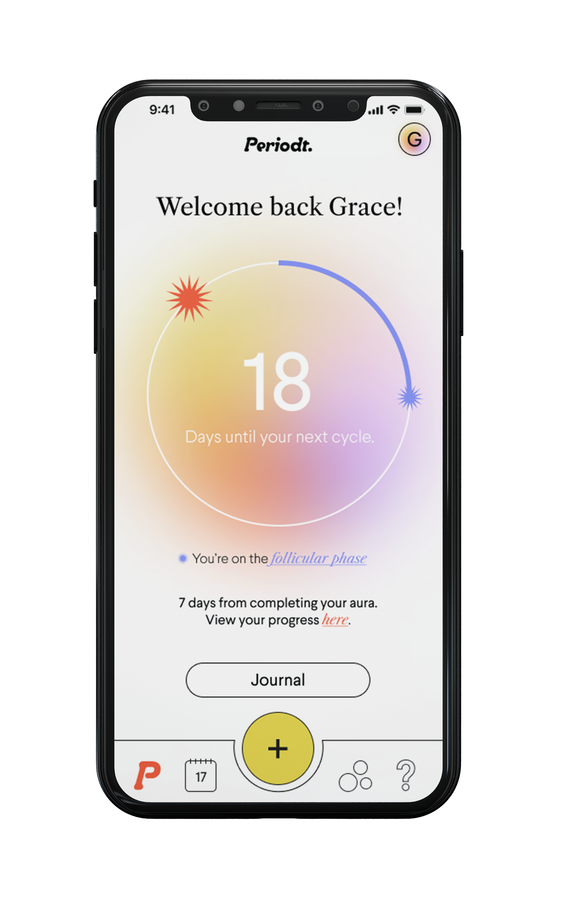
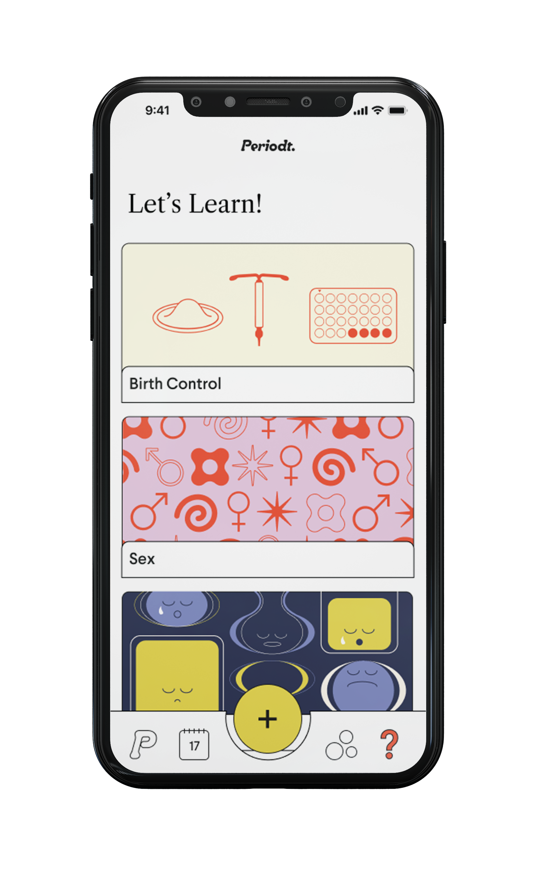
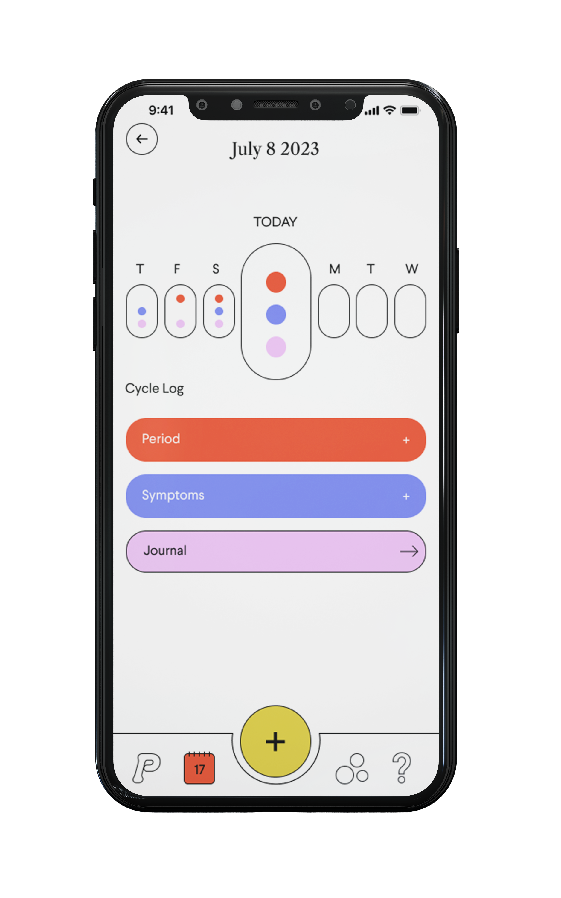
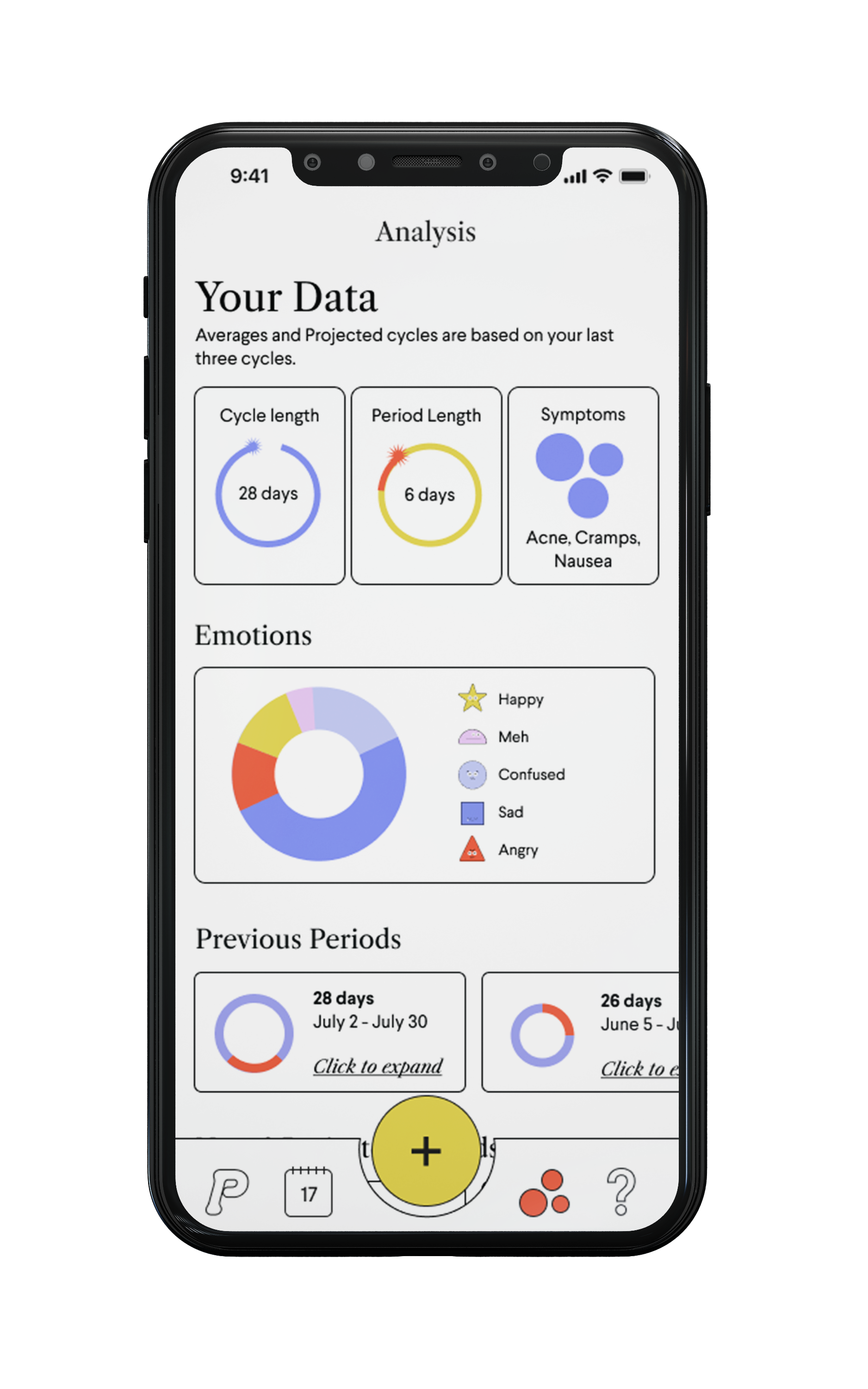
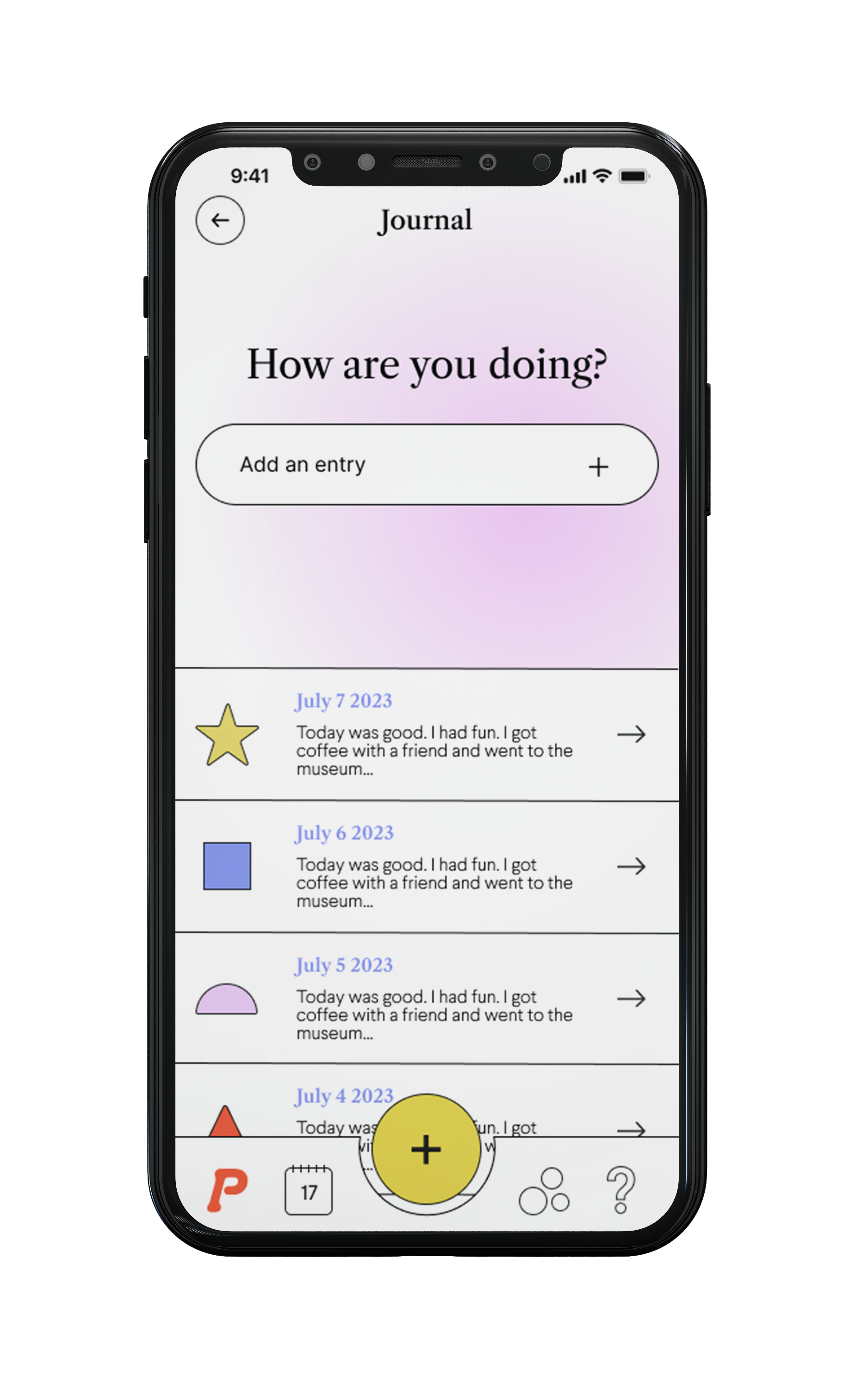
A period tracking app in tune with mental health. This app is available to anyone with a menstrual cycle and looking into a more efficient way to track their period or current cycle. Features include a journal entry section, tracking periods (light, medium, heavy), a place to learn more about your body, and lastly an analysis of data related to your period tracking.
In creating this app it was a very collaborative process when working in a group with Rafaela Schomburgk, Kiva LeFors, and Penelope Clark.
PROCESS: RESEARCH
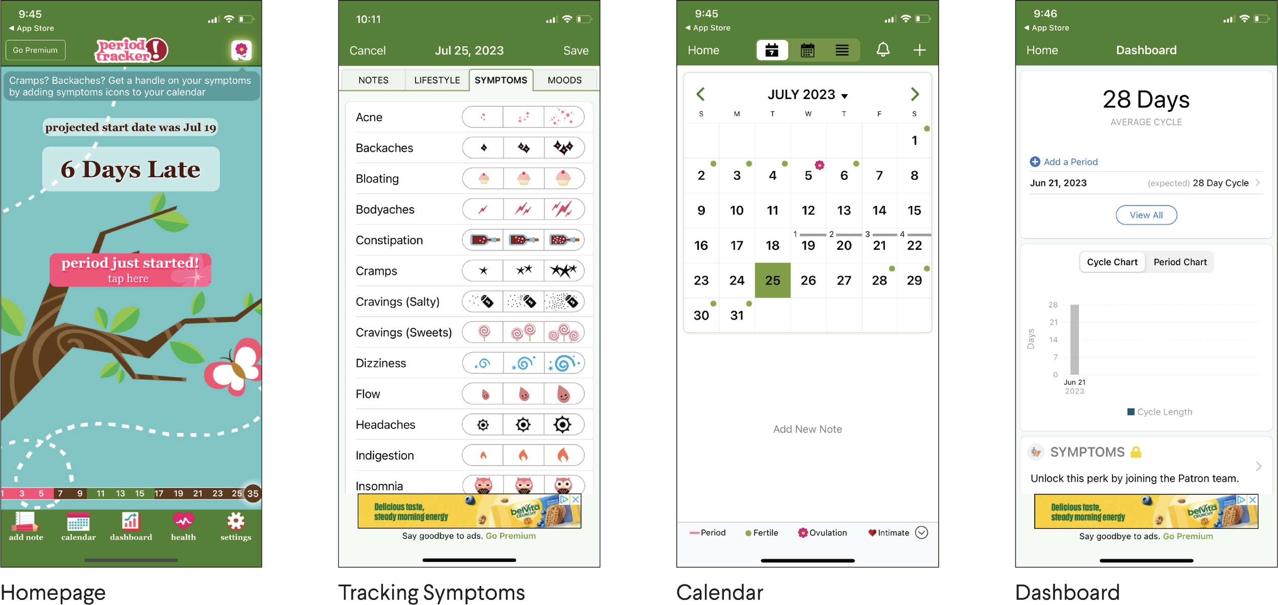
Before beginning to create our app we conducted research of what kind of app we wanted to redesign, eventually we landed on some type of period tracking app. After discussion we discovered an app called Period Tracker. In this complete redesign we set goals and objectives for our new app.
PROCESS: OUR PERSONAS
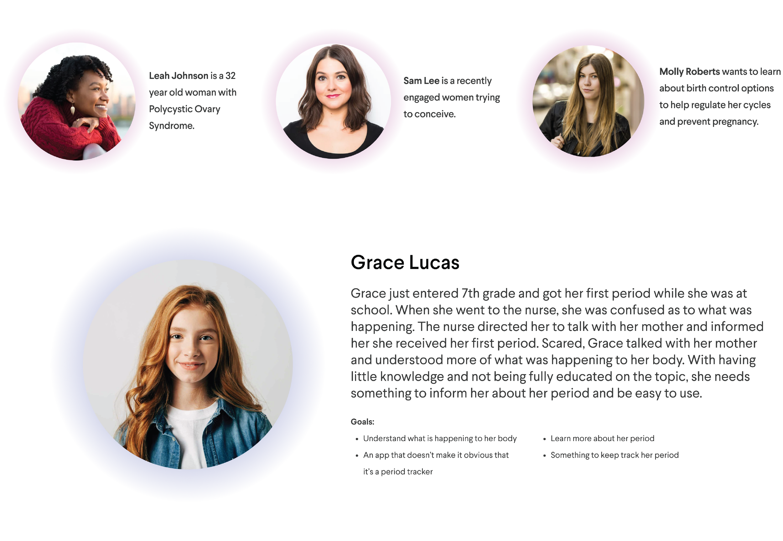
These are three personas we used to aid us in organizing the app that focuses on different user needs. This is just a small percentage of the group of users that would use the app.
Personal highlight: Grace is a persona we mainly focused on as we all saw ourselves in her. Like Grace, many people experience their first period feel confused and scared. Therefore we wanted users like Grace to feel welcomed and create a positive experience in a world that doesn’t fully educate you about your body.
PROCESS: INFORMATION ARCHITECTURE
PROCESS: MOODBOARD
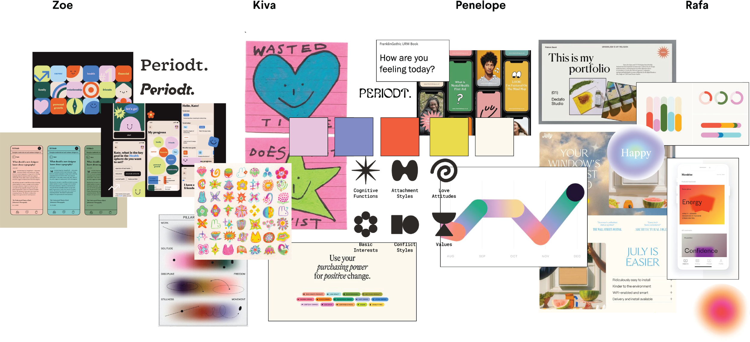
We all had different thoughts and opinions of how we wanted the app to look. We all individually created moodboards of the aesthetics we preferred. This then created a conversation about the next steps to take in the sketching process.
PROCESS: STYLE GUIDE
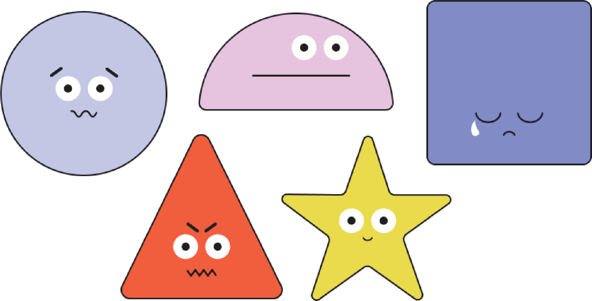
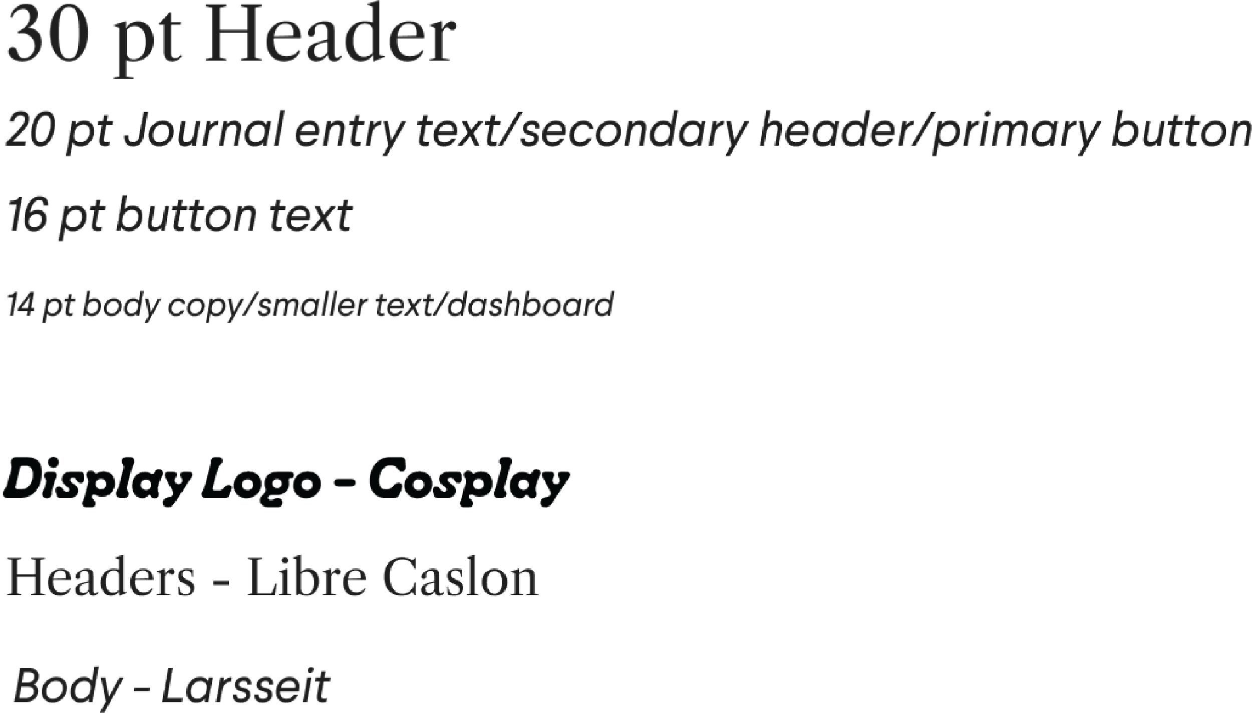
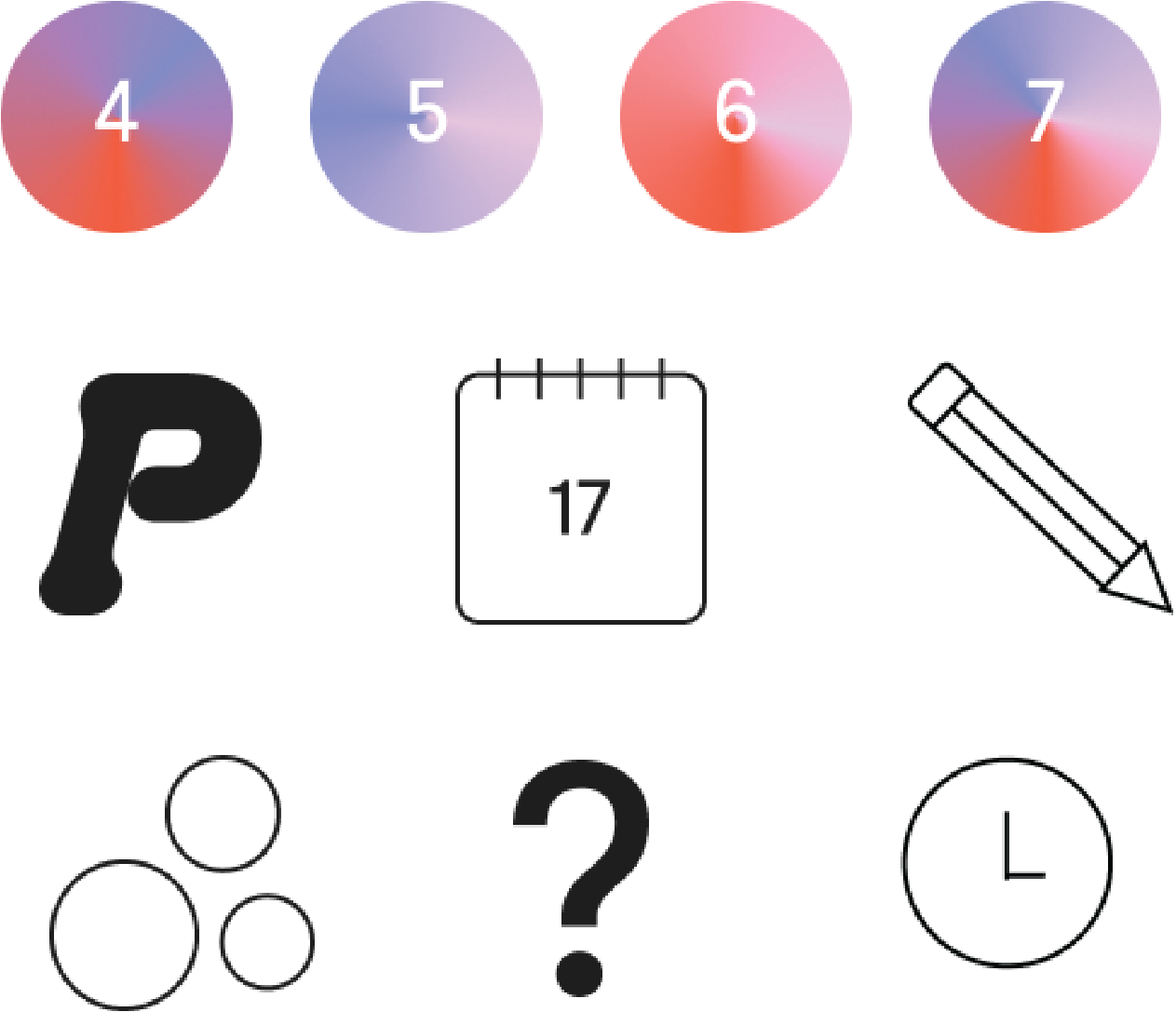
We wanted the app to feel airy, modern, youthful (but not childish). Something that felt calming and that resembled a safe space. We customized each symbol, the illustration style, and image treatment.
APP DESIGN
ICONS
TYPOGRAPHY
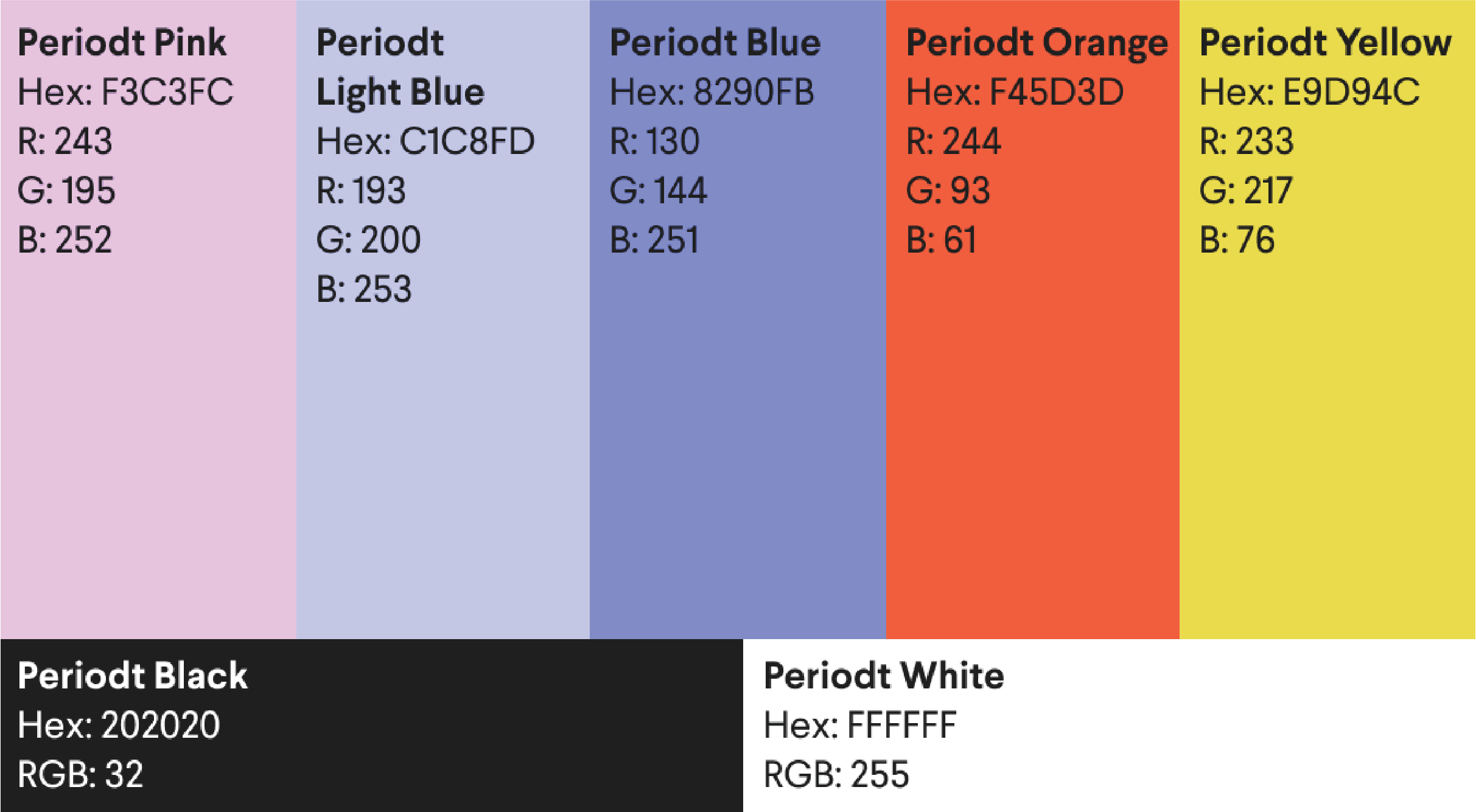
COLOR PALETTE
PRIMARY & SECONDARY BUTTONS
NAVIGATION BUTTONS
PROCESS: SKETCHES
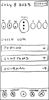
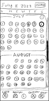
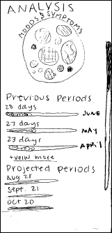
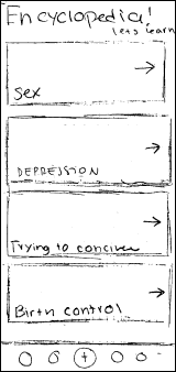
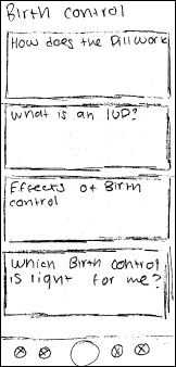
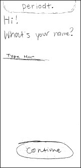
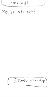
At this point in the process, my group members and I had an open discussion when creating our sketches. We talked about pages we deemed important for our users and other pages that could be useful in generating a positive experience with our app.
ONBOARDING
CALENDAR
ANALYSIS
LEARN
PROCESS: BLACK AND WHITE WIREFRAMES
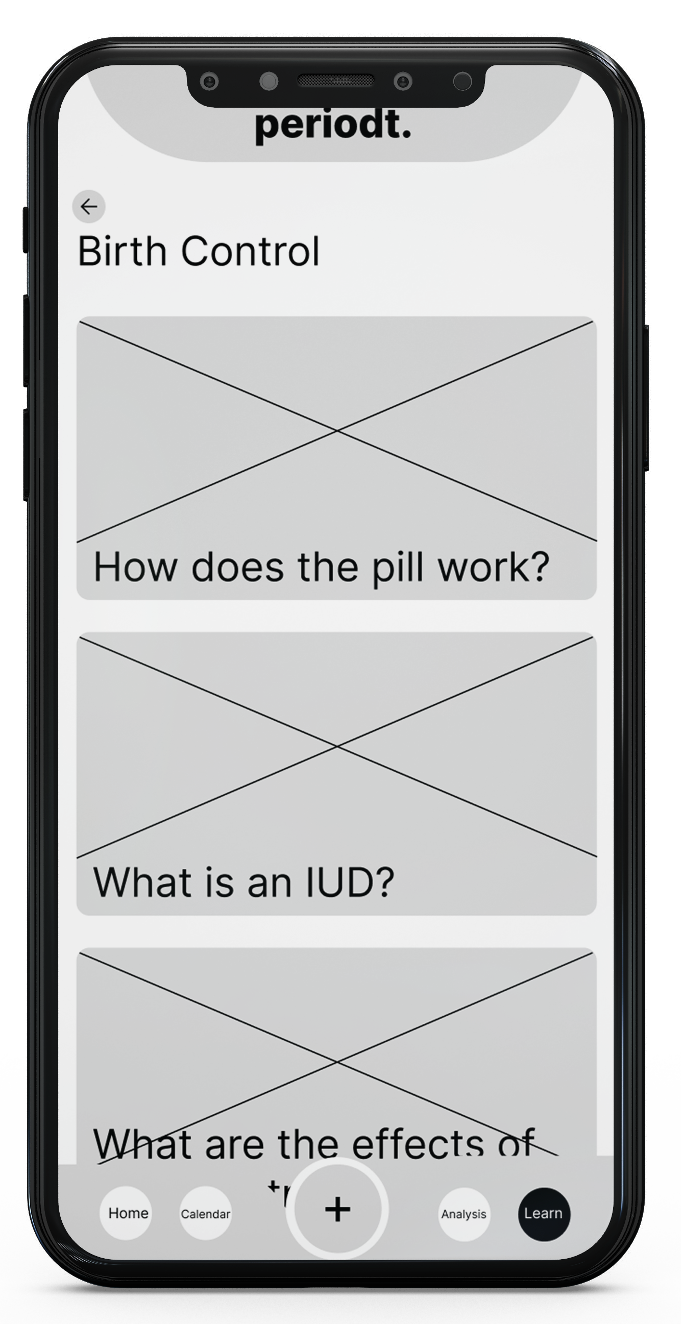
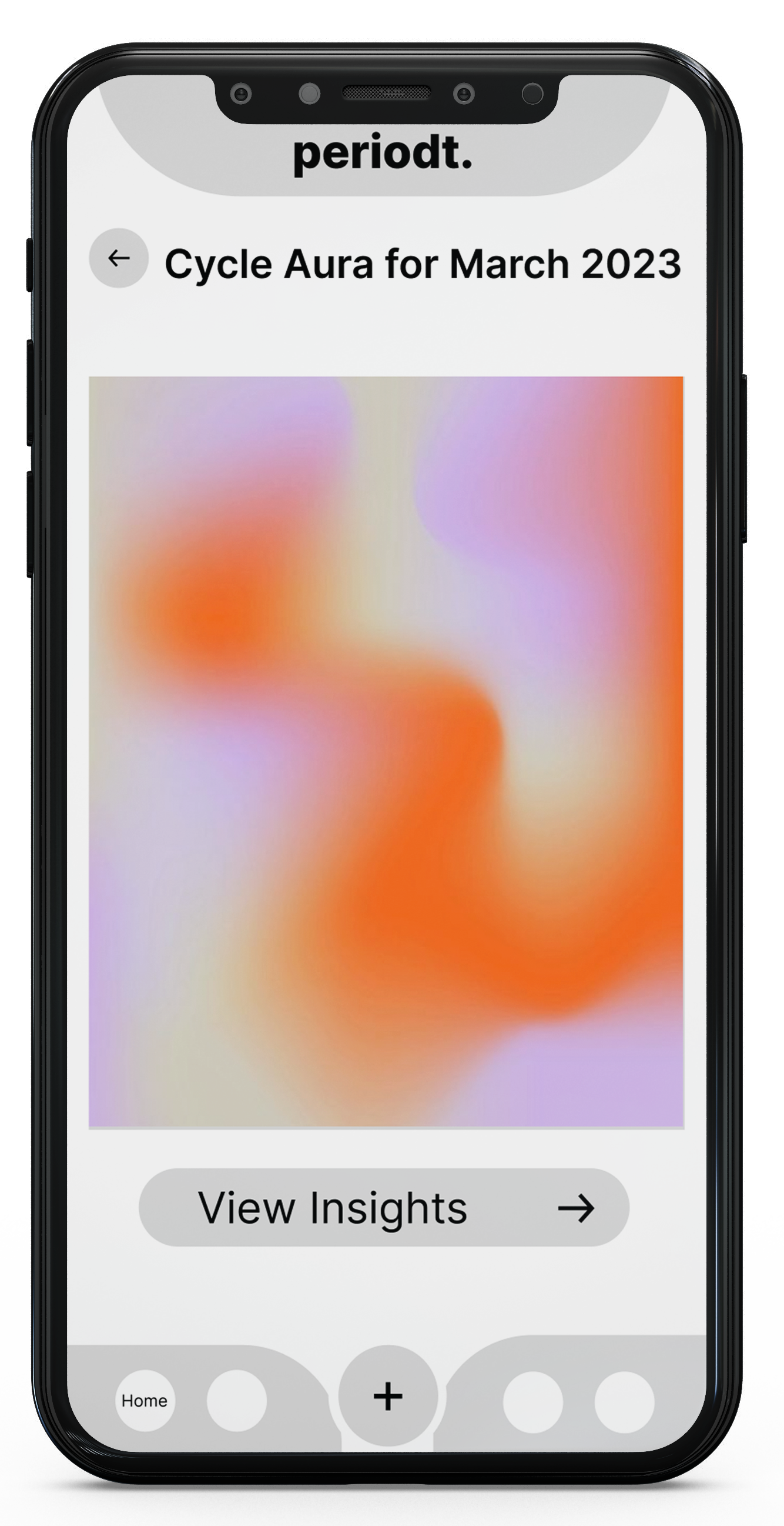
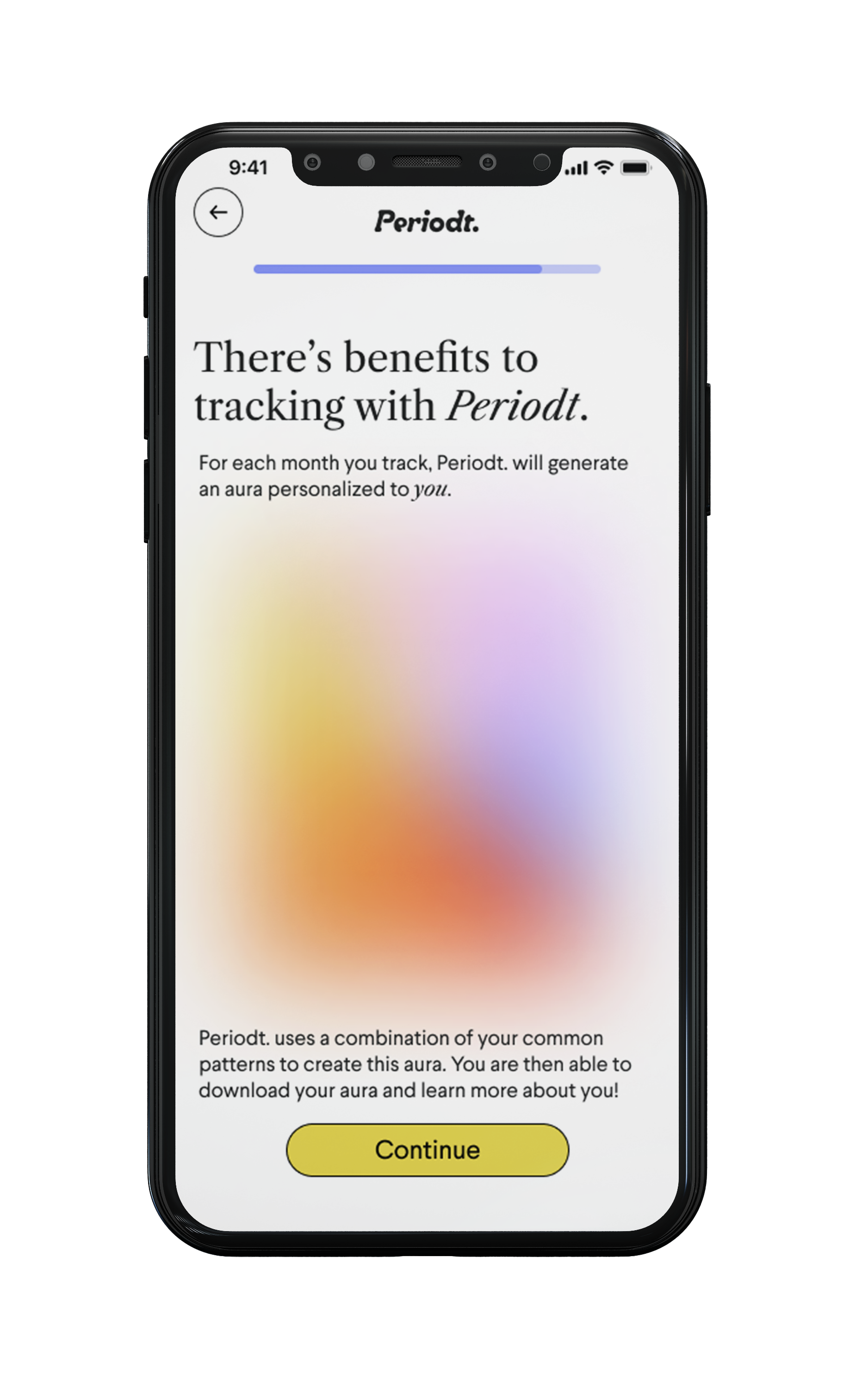
With finalizing some of our key pages in our sketching process taking things digital we were able to expand more on the idea of making the app more rewarding for tracking their period on our app. This led to us including the journal, data, and aura elements into our final design.
ONBOARDING
CALENDAR
HOMEPAGE
ANALYSIS
JOURNAL
LEARN
AURA
FINAL PRODUCT
FIGMA WALKTHROUGH
To test out the app we created a walkthrough to show all the features within Periodt. Below is a OR code to try it out for yourself!


