LET’S GO!
UX/UI, FIGMA, AND BRAND DEVELOPMENT
When going out with friends for a special occasion or planning a weekend getaway a couple of issues arise with all the excitement involving safety and planning. It’s common to run into the issues of a friend lingering off, not knowing where to go, the endless airdropping of photos, and lack of communication. With the idea that going out or traveling it should be fun and eventful the logistics tend to get in the way and hinder a person’s experience.
Therefore, the app I have created makes tracking, sharing, and communication easier and more accessible. In this app, you can see your friend’s locations, Images or videos they take that night or weekend, and an optimized itinerary of your plans. This all can be used on a local or travel basis to make your night out or trip go as smoothly as possible with planning and safety as the top priority all in one app.
PROCESS: RESEARCH
In these stages of the app creation, I wanted this app to become a more centralized space. Rather than going from a Google document with the itinerary to texting on iMessage, to Find my iPhone, this app serves as a one-stop location to decrease the amount of apps to jump to and from.
PROCESS: PERSONAS
PROCESS: INFORMATION ARCHITECTURE
In my user testing I worked with these two user flows:
User 1:
Starting a new itinerary for a trip to Nashville and use the explore tab to help build out the trip and then look at the route people will be taking for that day.
User 2:
A new user who got invited on a trip and is exploring where to find shared locations, chats, photos, alerts for the area they are in, and wants to suggest an activity for the itinerary.
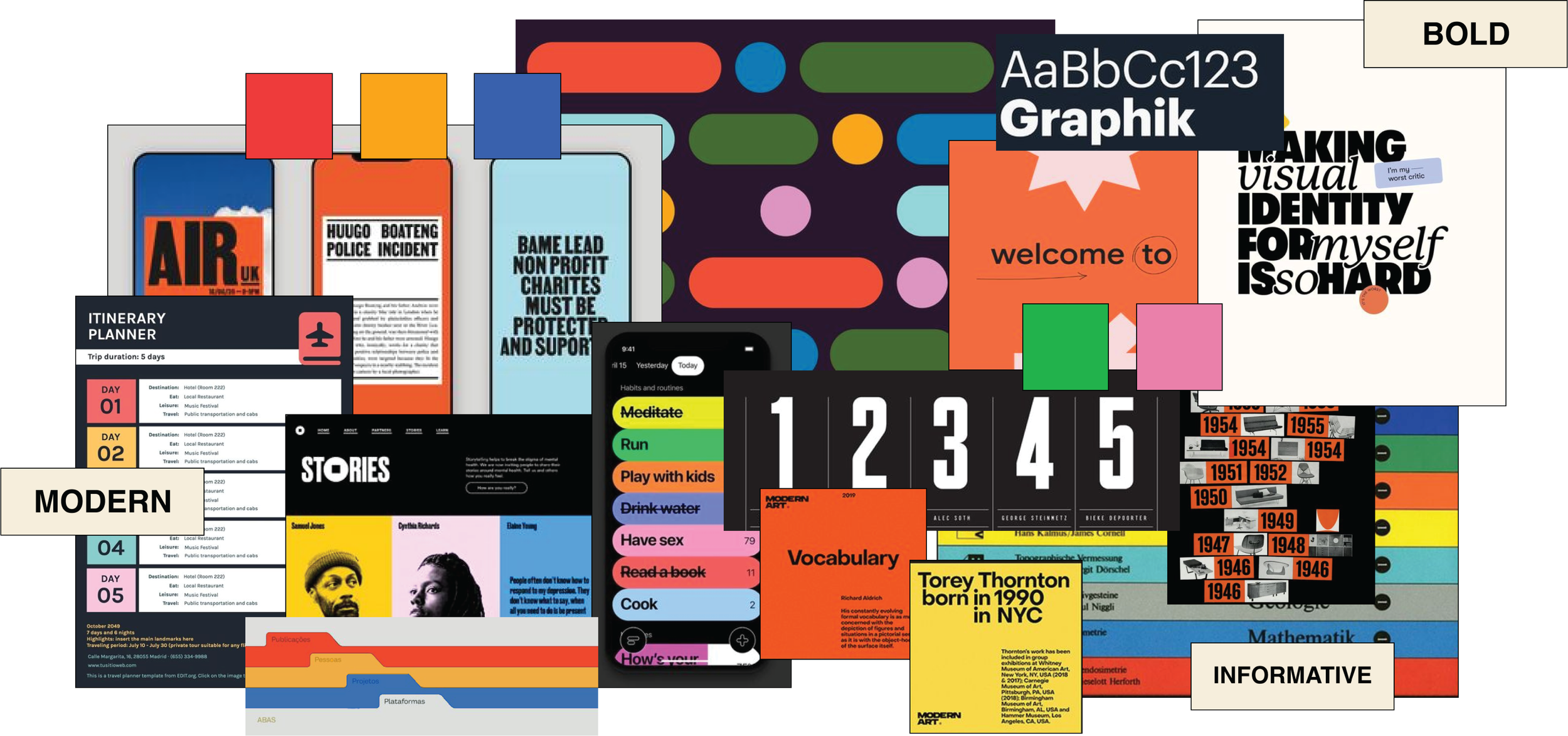
PROCESS: MOODBOARD
A more flamboyant color palette and method of hierarchy to nod towards the excitement that surrounds your potential upcoming travel plans. Emphasis on contrast is desired to be fluid throughout the final design to make all segments digestible.
PROCESS: STYLE GUIDE
In creating the look and identity of this app I chose colors based on the idea of “action” and “excitement”.
Graphik and Helvetica were chosen as a typography pairing to offer a friendly face to creating itineraries which can oftentimes become overwhelming.
In the logo/app design, I wanted to play more off the idea of action in creating a movement with the design and included moments of closure symbolizing a “plan coming together”.
APP DESIGN
TYPOGRAPHY
ICONS
COLOR PALETTE
BUTTONS
EXPLORATION BUTTONS
PROCESS: SKETCHES
In the process of experimenting to make the app feel personalized, I decided to implement an onboarding process for preferences based on the user.
Homepage
Onboarding
One of the features I wanted to include was an area to make an itinerary based on your trip or night out. In this phase, I began exploring other features to pair with the idea of making a “plan”.
Itinerary Planning
For this app to also serve as an all-in-one touch point I included chats as part of the information architecture. The chats are also a point to share photos temporarily, view other’s locations, and see upcoming events for the group.
Chats
Shared Locations
PROCESS: DIGITAL SKETCHES
In this next phase, decisions became more structured in the pages I wanted to include in the final design. In this sketching process, the location of buttons, following a grid system, and spacing were in great consideration.
Homepage
Onboarding
Chats
Itinerary Planning
Locations / Safety
Account
FINAL DESIGN
FIGMA WALKTHROUGH
To test out the app I created a walkthrough to show all the features within LET’S GO! Below is a QR code to try it out for yourself!


