MAPCO WITH CHUTE GERDEMAN
ENVIRONMENTAL, WAYFINDING, AND BRANDING
In my first co-op rotation, I got the privilege of working with Chute Gerdeman. My time at Chute Gerdeman gave me great exposure to environmental design. Being a part of this organization we created things that told the story of our brands through a physical experience for the consumer. In terms of my role, I was part of the brand communication design team where we focused a lot on the environmental branding of space in doing so involved collaboration with the environmental and design development team to make creative ideas come to life.
Being included on this team I worked collaboratively with lead designers on active projects. Because of this, I touched on numerous projects that involved referencing site places, using elevations with CAD tools, and participating in many critiques. More specifically, one of the major projects I got to be on was MAPCO, a convenience store that wanted to elevate the gas station experience.
PROCESS: MISC INTERIOR SIGNAGE
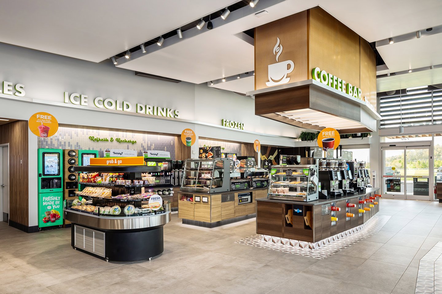
GETTING A FEEL FOR THE STORES
Previous to the time I worked with Chute Gerdeman they began working with MAPCO on re-evaluating their store layout to find effective points of wayfinding. With this Chute Gerdeman provided MAPCO with work that was refreshed and very customer-focused.
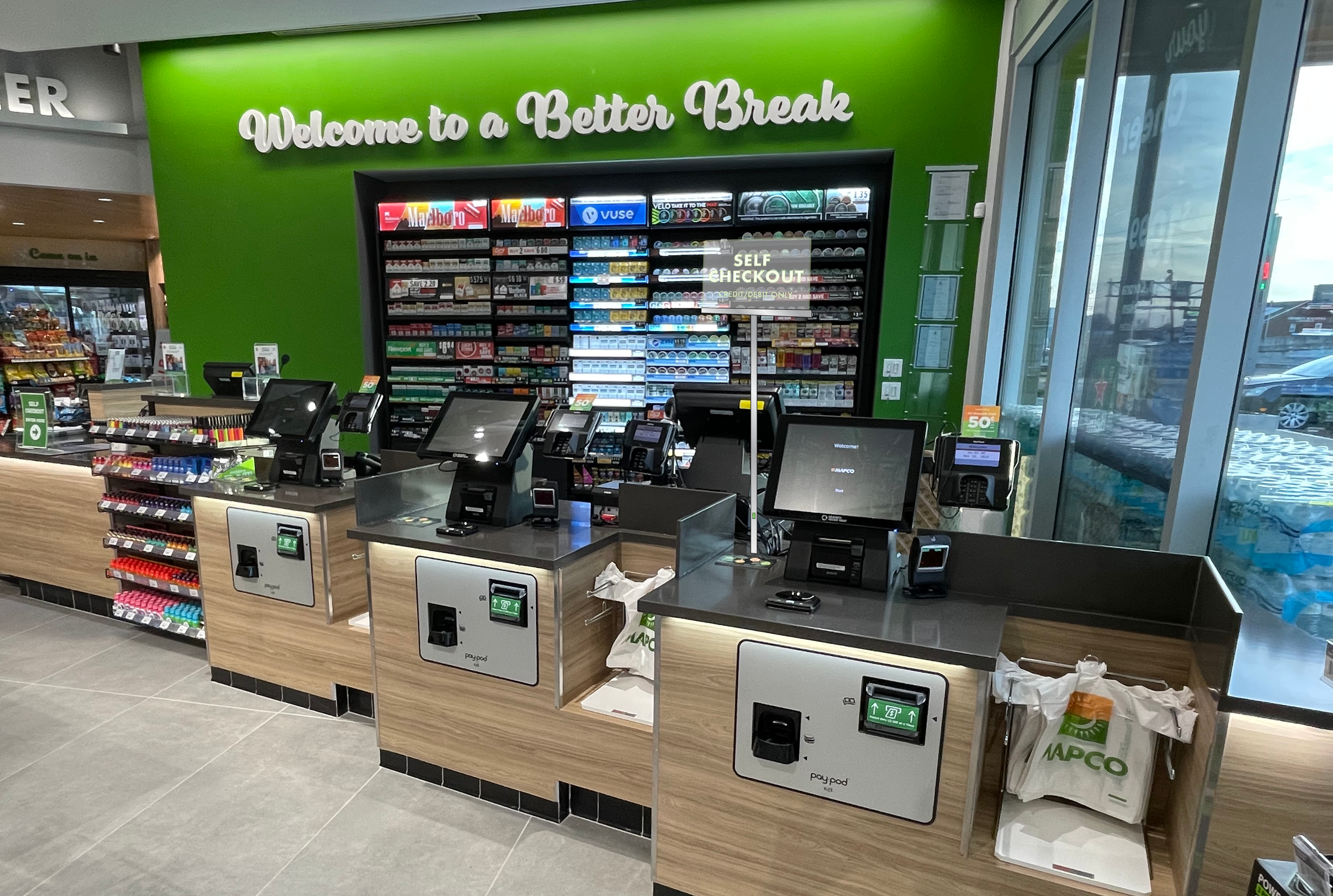
In terms of my place on this project, I was given some miscellaneous signage that needed to be conducted for some of their new store locations. These new signs included a self-checkout sign and two pylon signs.
FACING ENTRANCE/EXIT PERSPECTIVE
FACING-SELF CHECKOUT COUNTER
PROCESS: DIMENSION SKETCHES
To figure out an effective implementation of this new interior sign I created reiterations of dimensions and created digital creations of the type of sign the client was asking for.
PROCESS: FINAL PRODUCT
We proposed a few size options to the client starting with the dimensions they gave us for reference. After printing out the sign and testing the readability with the distance we determined that it needed to be smaller so we recommended a self-checkout side that was 1’ - 0” x 1’ - 6”. The next step in the process involved collaboration with the development team to figure out the proper execution of this sign for it to be sturdy and obtain the ability to light up.
PROCESS: FINAL PRODUCT
To present the final product of the sign I created a mockup demonstrating the look of the sign in a hypothetical format.
PROCESS: MISC EXTERIOR SIGNAGE
DIGITAL SKETCHES
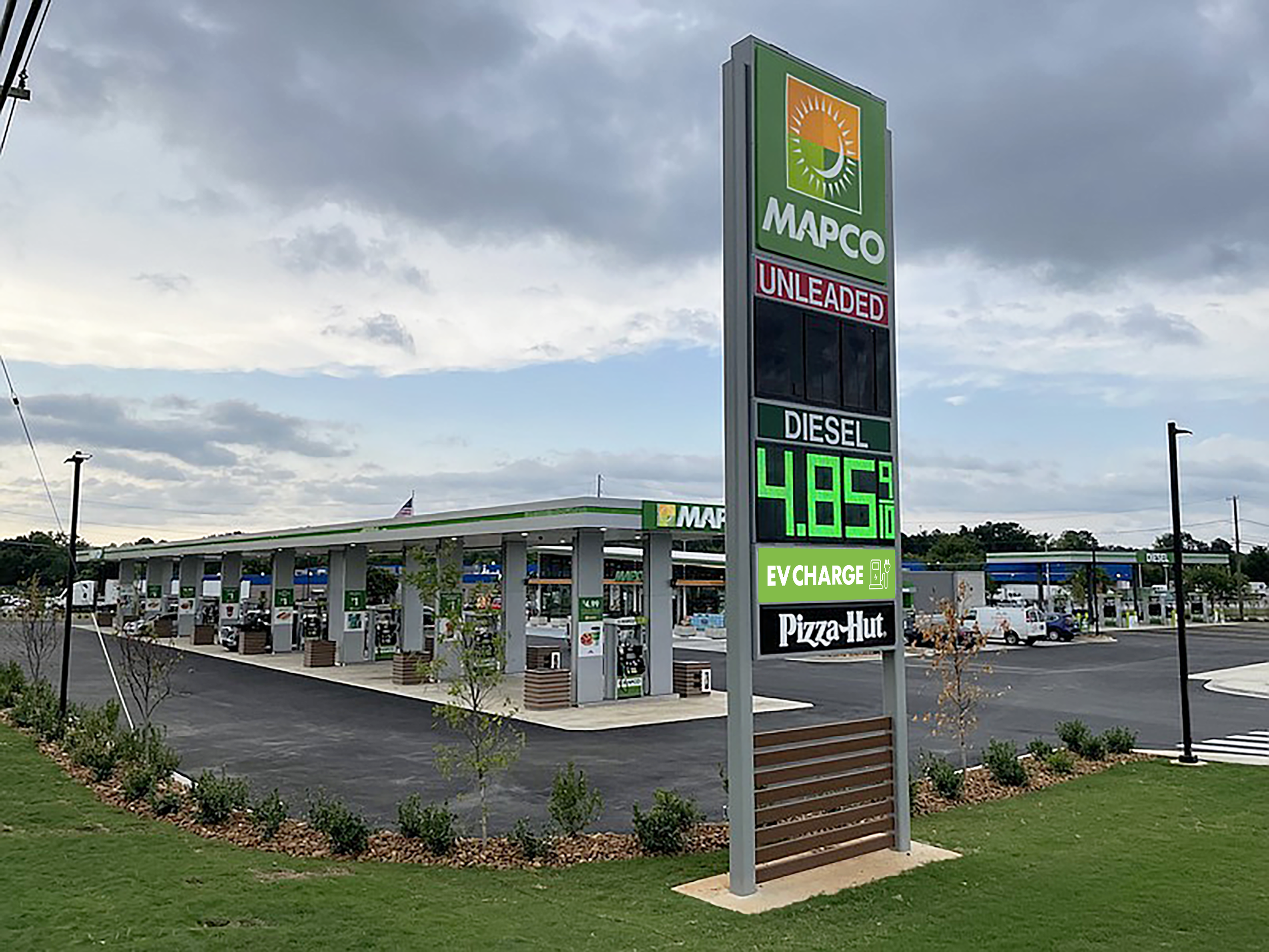
In terms of the exterior signage this mainly included new pylon signage for electric vehicle charging and carwash. In creating the pylon signs I kept in mind that the viewpoint would be short due to cars passing by fast. So I selected imagery and text that can be easily digested with a one-second glance.
EV CHARGING
CARWASH
PROCESS: FINAL PYLON SIGNS
To test the effectiveness of the imagery and type I ran printing tests to gain perspective of their readability from far distances.


